
Version 2.5.1 Released
Version 2.5.1 Is Out Now!
Version 2.5.0 Released
Version 2.5.0 Is Out Now!
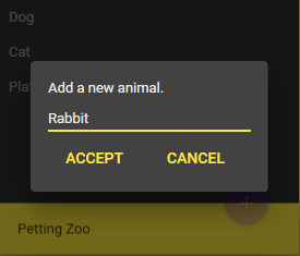
Material Design In XAML 2.5.0 (finally!) supports dark theme dialogs:
At long last Material Design In XAML supports dark themed dialogs.
Dialogs can also now be embedded within a visual tree using Style="{StaticResource MaterialDesignEmbeddedDialogHost}", in addition to the default popup window style
Continuing support for MahApps with 1.6.5 intergration.
The Material Design Icon Pack has been updated.
The TimePicker control now supports seconds selection.
Please check the release notes for a complete list of changes.
Version 2.4.0 Released
Version 2.4.0 Is Out Now!
Material Design In XAML 2.4.0 allows advanced TreeView customisations helping you to bring advanced UI and actions closer to the context for which they are intended.
With the new materialDesign:TreeViewAssist. AdditionalTemplateSelector attached property a node's visual tree can contain can additional content, outside of the standard rippled selection area of the node.
As with XAML, any content can re-rendered for the TreeViewItem or its data context. This easily enables a tree view navigation to be combined with contextual information and interactions, easily visible to the user.

The icon pack has been updated with all your favourite new icons from materialdesignicons.com.
Various other fixes from the community are also included. Please check the release notes for a complete list.
Version 2.3.1 Released
Version 2.3.1 Now Available!
Material Design In XAML 2.3.1 contains various bug fixes, enhancements, and new progress bar variants of some standard buttons:
If you are familiar with the Google Driving app, or other Android apps then you may recognise these buttons.
Use the new materialDesign:ButtonProgressAssist.Value extension method on supported buttons to display progress to the user.

Use the new materialDesign:ButtonProgressAssist.Value extension method on supported buttons to display progress to the user.

Version 2.3.0 Released
Version 2.3.0 Now Available!
Material Design In XAML 2.3.0 is out now, including the following new features:
Cards...or indeed any XAML content can easily be flipped using the new Flipper control and MaterialDesignCardFlipper style.

Buttons or other XAML content can easily be badges using the new Badged control.
Badges can contain any content, from counters to PackIcon instances.

Toolbar theme has been improved and supports badges.
We have a ListView.GridView style (to accompany the existing DataGrid style).